Saturday, December 31, 2011

What will 2012 bring the Digital Video Space, especially in #SecondScreen?


For the past 6 weeks, I have been focusing largely on Second Screen apps.  I have reviewed 22 of the most written about apps that allow you to watch sports with more data at your finger tips, check-in to a show, share your thoughts with your friends and the wider world, find content from multiple sources, control the first screen, engage in commerce, get extreme videophile content syncrhonized to your viewing experience, and help you discover new and interesting content.

I have covered widely publicized apps such as IntoNow, GetGlue, Yap.tv, Fanhattan, zeebox, Clicker, Miso and Umami.  I've covered a few operator apps, a few sports apps, and a few Blu-ray title specific apps.

I have tried to summarize these apps based on their ability to provide five major feature sets:

1.  Simple.  The ability to allow control of the first screen.
2.  Social.  The ability to share your thoughts with others.
3.  Seamless.  The ability to integrate multiple sources of content.
4.  Stimulating.  The ability to provide additional information and to enrich your viewing experience.
5.  Discovery.  The ability to enable you to find new and interesting content based on your preferences.

As we head into 2012 and into CES in a few weeks, I wanted to give everyone an idea of what I have planned:

- I plan to finish another 10-15 reviews and then to summarize those apps for this audience.
- I plan to present the landscape of players in their supporting ecosystem and how they interact with each other.
- I am hoping that many of those apps will present a major refresh at CES and I will review their improvements.

Post-CES, I am hoping to continue to flesh-out this space (there are more than 75 apps now in this space), providing greater insight to the various segments of apps that are forming to specialize around sports, synchronized content, social communication, etc.  If possible, I hope to help bring together a conference specifically on this subject.

I think 2012 will be the year the majority of tech-savvy consumers (esp. 13-24 year olds) look back and say, "That was the year when my TV viewing experience changed."  

Let's hope we can figure out how to be a part of that and provide more value to our consumers, our content brands, and our shareholders.

Happy New Year!

My Review of Tunerfish as a SecondScreen Experience

While Tunerfish is mentioned in a few articles on the web, it doesn't get nearly the notoriety as GetGlue, IntoNow, or Yap.tv.  However, as a simple TV or Film  "check-in" service, it is very similar.  When you first open the app, it asks you to register your Facebook and/or Twitter accounts.  Like many of the apps, it disappoints by explaining to you that your Facebook friends have to additionally sign-in to Tunerfish to be your friend there, too.  From there, it is similar to other Check-in-type apps--you can comment to those watching a show, you can become a fan or check-in, etc.  You get very little in the way of Stimulating content (not even the cast), and no sense of Seamless content aggregation or Discovery of new content.  The app has a long ways to go if it is going to hold on to consumers over the other options out there.

Simple.  No ability to control the first screen.  None.
Social.  Rudimentary social capability, requiring your friends to "re-friend" you on Tunerfish, etc.  Low.
Seamless.  No current ability to even understand your primary video provider.  None,
Stimulating.  Very little additional content about the movie or TV episode you are watching.  None.
Discovery.  Nothing more than a "Popular Now" section.  None.


Thursday, December 29, 2011

My review of Fav.tv as a SecondScreen Experience

I don't think the developers of Fav.tv intended this to be a second screen app.  The app seems to be developed more as a digital assistant-type app, reminding you when you favorite shows are on.  Essentially, you tell it what shows you like (and who your Live TV provider is during registration) and it tells you when the show is next on (alerts you if you like).  It also has a news feature which can be filtered by your favorite shows which is interesting, but all of these features seem like something that will soon be added to other apps (IntoNow, Fanhattan, zeebox) vs. something substantial enough for a stand alone experience.


Simple.  No ability to control the first screen.  None.

Social.  You can "check-in", but there is no integration with Facebook or Twitter, only Fav.tv friends. Very low.

Seamless.  No integration of content sources other than your stated live TV provider feed.  None.

Stimulating.  I am not sure the news feature really counts here.  Very low.

Discovery.  While there is constantly the "opportunity" to see featured shows presented to you, that is not really a Discovery capability.  None.


Wednesday, December 28, 2011

My Review of Tron Legacy as a SecondScreen Experience

Sat and watched the Blu-ray version of the movie with my son today.  He was in awe of the special effects and the story-line, and found the concept of a second screen even "cooler" (he's 8).  While the movie was great, the second screen experience was didn't match it.  During start-up of the app, you are asked to choose their Audio Sync option provided by TVplus, a manual sync or explore on your own (presumably without the movie playing).  It said a Wi-Fi sync would work if the BD player was connected, Bluetooth turned off on iPad, etc--not an option today.  I tried to get the audio sync to work for about 20 minutes before giving up.  I tried different scenes, I tried getting everyone in the room to be perfectly quiet, turned up the sound, etc.  Ultimately, I used the manual sync to test the experience--I can imagine at this point most consumers are giving up instead (rather than restart the movie like I had to).


The content displayed during the timeline (with manual sync) wasn't that "engaging".  There was an event about every 30 seconds or so, but often just story board drawings or pre-production photos with no explanation.  Occasionally there was an interesting fact with an explanation, but not much more than that.  There was no way to use the app to control your Blu-ray experience.

Simple.  I will re-test when I have a connected Blu-ray player to see if you can control the 1st screen then--but there is no control with audio, manual, etc (not surprising).  None.

Social.  No ability to share with Facebook or Twitter friends.  None.

Seamless.  No integration of other sources of content.

Stimulating.  In theory, the primary purpose of the app itself.  However, while the synchronized experience is a step up from most apps, they didn't spend enough time on the UX of it all.  As stated above, a few simple explanations on many of the images they presented could have been incredibly Stimulating.  There could have been references to the first movie, the game from the 80s, a more stimulating content to view as the events presented, the ability to share those images with friends, etc. It seems like they had a great idea but forgot to put the budget together to make it a great consumer experience.  Medium (for the sync) to low (for the poor content).

Discovery.  None.

Using Fanhattan for new TV series Discovery

The other night, sitting in a hotel over the holidays, my wife asked me if I had any recommendations for a new TV series to start watching on her iPad.  I thought this was an excellent chance to try out the Discovery powers of the SecondScreen apps we have reviewed here so far.  While GetGlue, BuddyTV and Fanhattan all had "medium" levels of Discovery capabilities, I thought Fanhattan hadthe best UX (user experience) and the most sophisticated way for the user to slice and dice the options for Discovering content.

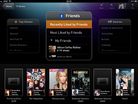
I sat with my very suspicious wife and opened the app on my iPad.  I gave her a quick introduction to the different ways to view recommended TV Series (Hottest, Newest, Hot Fall TV (probably paid placement), Emmy Winners and Top Rated).  She saw the opportunity to see a similar view from Friends, and while set for my Facebook friends (we share many of them anyway), it still offered many new content ideas for her.


Of course, she immediately chose something that we couldn't download to the iPad while travelling in London and gave me the "I told you so" look of disappointment in my wasting of her time.  I showed her how to use Smart Browse to quickly filter the results so she would only return items she could watch on her iPad (while traveling).  She was then able to flip back over to the Hottest or Top Rated shows and choose a new series.


Now while this is really a sophisticated version of Search vs. true Discovery, it is still light years ahead of the current method of combing thru Facebook recommendations or calling your friends (esp. when you are on the wrong timezone).

There are some profound possibilities coming...stay tuned to this space.


Monday, December 26, 2011

Another review of zeebox as a SecondScreen experience

Last night, after the family made its way through the big turkey dinner, the discussion turned to what to watch as a family on TV.  As everyone reach for their paper-based guides for the evening line-up, I pulled out my iPad with zeebox.  I think the experience was much better than last time for Stimulating content and the Social experience.  The ZeeTags were working much better, as were "Relevant Links".  However, it seems the quality of the experience is tied to the popularity of show (meaning Zeebox is pre-processing content with humans for the upcoming popular shows).

A walk thru my experience:

First, the guide still has several different ways to sort the channel line-up (channel order, popularity), but still is not a real way to Discover new programming.  Search is still very rudimentary.  And your "friends" on Zeebox is still limited to your Facebook friends who have ALSO signed up for Zeebox (I still get confused by this requirement--see my other posts on Fanhattan and BuddyTV).


The show level UX is getting better.  The Twitter posts flying by about every second is still very distracting and still don't appear curated, but at least for the first show I watched ("Downton Abbey"), the ZeeTags and relevant links worked and had mostly meaningful detail behind them.  The "Apps and Downloads" section was only mildly relevant (seemingly off a single keyword in the meta data vs. being curated).  The details on the actors/cast on the left hand side is still not linked and unless they appear additionally as a Zeetag, there is no way to access their information (other than switching to your IMDB app of course).


As you can see in this "Zeetag level" UX, the level of information is getting better, each with a further nested level of related News and Apps/Downloads.


But the minute I left a clearly largely popular show (#1 during most of the 9pm viewing time), the level of accuracy and relevancy of the related Stimulating information fell off a cliff.  Below you can see the AbFab special with no relevant links what so ever (the Bourne Supremacy was nearly barren all over).  This is one of the larger SecondScreen problems to be solved--the rich meta data issue, allowing for a more automated approach to populating MANY, MANY shows vs. curating a few shows with humans and leaving the rest as a wasteland.


So, I am glad this was better than last week's performance, but I think it is more the result of the shows I tested than any major improvement in the underlying service.  I still owe a review with a "controllable TV" and during a show with pre-populated ZeeTags ("Desperate Scouse Wives").

Summary:
- Simple.  Still low to medium--waiting for confirmation.
- Social.  Still medium.  Need to curate (and slow down) the Twitter feeds and improve the "friending" process and capability.
- Seamless.  Still none.
- Stimulating.  Better, but room to improve significantly on catalog shows.
- Discovery.  Still none really.

Wednesday, December 21, 2011

My Review of Zeebox as a SecondScreen Experience

I had heard a lot of fanfare about Zeebox from UK colleagues and even saw them claiming to be the "Google of TV" in a recent article.  Having landed in the UK for the holidays, I thought I would give it a try.  Now to be fair, I am told they curate certain shows with syncrhonized content call "ZeeTags" (currently done for "Desperate Scousewives"), but I did not get to experience that yet (will try it out next Monday).  There is also the ability for it to control the first screen for some TV's (see further below), but I am still trying to find a television set with the right OS to sample that experience as well.

The overall experience is decent, though not yet up to the hype built around it (at least as compared to other existing apps out there).  There is a guide-level UX that sorts itself by either current popularity, your friends' views of the show, or by the normal channel line-up.  Unfortunately, it only recognizes Zeebox friends vs. recognizing content your friends have liked on Facebook via other applications.


The detailed show-level view is also well done, with a quick summary of the actors and relevant links to the deeper meta data surrounding the show.  It also has a Twitter feed and provides the ability for you to comment directly during the show.  However, the UX starts to get a little ugly here are the Twitter feed does not seem to curated and literally updated about once a second when I was trying it out, making it distracting to the viewing experience (as a  comparison example, TVplus has curates the feed and promotes the "best" Tweet about every 45 seconds which is more manageable).  It does have the concept of "Live ZeeTags" which seem to populated from the audio stream, but clicking on them generally yields useless information not really relevant to the show.


Simple.  I am told that for certain TV's, the experience of having the iPad app tune directly to what you find in the guide view is a good experience.  If I get it working, I will update the blog.  Low to Medium.

Social.  While there is a good attempt at integrating Twitter and Facebook, the UX of that capability has a ways to go.  It needs to be able to recognize your Facebook friends regardless of their sign-up for the app (same with content likes) and the Twitter feed needs to be curated (and if possible, recorded from the live broadcast so there are no spoilers).  Medium.

Seamless.  There is currently no feature that integrates anything but the live TV guide of your provider (Free to air, cable, satellite).  None.

Stimulating.  There is at least one currently synchronized show ("Desperate Scousewives"), an attempt at Live Zee Tags for relevant information, some more detailed information and links about the cast & crew, etc.  It is no where near the level of Fanhattan yet, but heading in the right direction.  Medium.

Discovery.  I did not see evidence of a real discovery feature, but there was some rudimentary genre filtering based on friends recommendations, etc.  None to Low.


Sunday, December 18, 2011

My review of YAP.TV as a SecondScreen Experience

Yap.TV has had a ton of press lately with their new 3.0 version launch.  When you launch the app, it lets you choose from a grid guide approach to finding your show, the ever present search option, or a "Top 20" guide of shows that are trending now (presumably from Twitter activity but potentially via paid placement).  The app on your laptop or iPad is essentially a curated Twitter feed, with additional ability to take a poll, participate in "live chat", and the ability to see some additional photos about the show or the cast.


Not much more to it.  No real ability to control the 1st screen, to integrate other sources of content other than your cable/telco/sattelite provider, or to discover new shows (unless you view the trending feature a Discovery feature).  Quick summary: a ways to go to catch sync'd content apps (eg TVplus), 1st screen control apps (eg BuddyTV), or rich content apps (eg Fanhattan).


- Simple.  No ability (currently) to control your 1st screen.  None.

- Social.  A lot of Twitter and Facebook integration, some poll and live chat integration.  I'd like to see the Twitter feed for DVR'd or older content with the ability to show you tweets as of that time code in the show from the first airing or the ability to share clips, screen shots, etc.  Medium to High.

- Seamless.  No ability to integrate multiple sources of content.  None.

- Stimulating.  A small amount of additional content on the shows (actor and show photos).  Low.

- Discovery.  No discovery features other than search and trending.  None.

Thursday, December 15, 2011

Synchronizing the SecondScreen beyond Audio into the OTT app environment

I know most of us have discussed the coming evolution of this space many times, but it is great to see a milestone achieved in the marketplace.  The SecondScreen landscape is littered with attempts at providing a Stimulating experience--some much better than others.  There are a few efforts going on to create an exhaustive database of audio fingerprints and/or watermarks so that various audio syncing technologies can determine not only which show you are watching, but at what point you are in the show (the time code).  Once you know this, you can use scene level meta data (a subject for a different blog) to create a real Stimulating SecondScreen experience.

However, you can create a much better experience by being able to control the entire video environment--then you can fully know where the consumer is at any given second of the video.  There are 2 main stream opportunities in today's world to accomplish this.  The first is the Blu-ray environment: BD Live along with wi-fi syncing technology can allow the application develop to truly know exactly where the user is no matter how many times he/she moves around--in fact, you can use the experience to control the Blu-ray player.  The second opportunity exists with OTT video apps.  Think about Vudu, Netflix, Hulu, Boxee, etc, etc.  Because that application is serving up the video stream and managing the buffering and the trick play directly, it by definition knows which timecode the consumer is on all of the time.  Now it just needs to be married up with some great scene level contextual meta data and have communication to a compatible app on another device (your SecondScreen).

The article linked here is about the testing that capability on Boxee with Miso in a private Beta. Take this a step further.  Google TV claims they will allow third party apps to work in the background and that they will publish the APIs and push the resulting meta data back out to communicating apps--meaning they will create a potential SecondScreen ecosystem.  The more powerful and the 3rd way to make this synchronization happen is discussed at the end of the article.  The real holy grail is syncing directly into the Cable or Telco Set Top Box--then instead of accessing a small world of early adopters, you can actually start to penetrate main stream consumers with tablets and smart phones in 85m+ homes in the US alone.  If you can marry that up with engaging consumer experiences as a result--you have a powerful opportunity on your hands (whether for videophiles, commerce opportunities, or advertising).  WOW.

Miso Sync: A Second Screen Experiment Using Android & Boxee [EXCLUSIVE]


Wednesday, December 14, 2011

My review of ViEWer as a SecondScreen Experience

When I saw the recent article on Entertainment Weekly launching a new SecondScreen "app" for the X Factor, Surviror, etc, I was intrigued.  However, they may be a bit premature in their announcement that they are ready for the world (to be fair, they do have a "Beta" on the logo for the app).

First, the "app" so far only exists as a web experience (no iPhone, iPad or Android experience).  And to summarize the actual experience: it's a curated Twitter experience.  To be fair, the app does let you view the Tweet stream for recorded shows as if you were watching it live (you click "Replay" when you hit play on your DVR).  They also have their journalists Tweet along with you.  However, if all you are looking for is a curated Twitter feed (sans the journalist) there are plenty of iPad/Android apps in previous blogs that do that job with sync'd audio content so you can pause, rewind, etc.


Simple.  No control of the 1st screen.  In fact, the app itself is only tied to it when you click play on the TV and website at the same time.  Also, this is a web-only experience.  None.

Social.  The ability to follow recorded, time relevant Twitter feeds and to follow journalists in the process (assuming you read Entertainment Weekly) is a good experience.  Medium to high.

Seamless.  They only curate a few shows and offer no guide or other method to find content.  None.

Stimulating.  Other than the Social portion, no evidence of richer content or synchronized experiences.  None.

Discovery.  No evidence of offering up recommendations.  None.

Monday, December 12, 2011

My Review of U-verse Mobile App as a SecondScreen Experience

The U-verse "mobile" app is a much better experience than the Time Warner Cable app, but still supports my theory that the providers will only do the bare minimum for SecondScreen experiences.  It has a great guide and search feature even when you are not in the home (hence the "mobile" in the title when the app launches). The access to the guide and the DVR is for managing the DVR function only--it will not tune the box to that channel (which is very odd since Buddy TV uses the AT&T APIs and will change the channel for you, etc)..  It also has a 1st screen "download and play" feature (which for some titles will work outside your home)--and AT&T ensures you must have one of the higher priced packages before this feature is enabled.  This is a great app for when you are on the road and want to set the DVR to record something or if you are on the couch and can't face trying to search the U-verse guide with the 10-foot remote experience, but falls way short of an actual SecondScreen experience.


- Simple.  While it has great access to the guide, a decent search function, and access to the DVR to record or delete recordings, it does not allow you to surf the guide and then make it play on your TV.  Since Buddy TV can do this, I would hope this small feature comes soon.  Low.


- Social.  No evidence of any Twitter or Facebook integration.  None.

- Seamless.  No evidence of any other sources of content.  None.

- Stimulating.  Only very rudimentary guide-level meta data available on the shows you want to watch.  None.

- Discovery.  No discovery features to help you find new shows to watch.  None.

My Review of TimeWarner Cable TV App as a SecondScreen Experience

I do believe that most of the video service providers (Cable MSOs, Telcos, or Sattelite) will do the minimum required to reduce the churn of their service (vs. 3rd party apps trying to create a revenue stream).  This app is good evidence of that theory.  The app struggled to work with the cable box, and without the box speaking to the app, it was only usable as a 1st screen app (ie streamed channels for TV Everywhere).  However, that TV Everywhere concept only works when you are in the house--more like a "TV In Your House" feature--except I already have TV's in my house...


Ironically, without the app communicating to the cable box, you cannot even bring up the guide (very odd design).  So I will give this a quick go, but will definitely need to come back later on the DVR and Guide functionality (channel change, etc).


- Simple.  The app's main purpose seems to be to provide DVR and Guide functionality (channel change, etc).  My guess is that this will be a medium once I get customer service to fix my neighbor's box integration.  Medium.

- Social.  No evidence of any integration of Facebook or Twitter.  None.

- Seamless.  There is no attempt to integrate any content other than that of Time Warner Cable.  None.

- Stimulating.  No evidence of anything other than the guide data.  None.

- Discovery.  No evidence of any ability to help you discover any content.  None.

Back soon to confirm the views on Simple.

Thursday, December 8, 2011

A look at the #Bing search function in the new #XboxLive media UX

I spent more time with the much discussed search feature tonight.  I was actually pretty impressed with the search capability (searches across video, music, games).  I also wanted to check it was searching multiple sources (as shown in their commercial).  The good news:  it is!  The bad news for consumers: they are applying business rule filters (not surprisingly) which seem to be "if the title is available in the Zune video marketplace, do not show Netflix or Hulu option."  I can't guarantee that since I did find instances of it available on Netflix and Zune, but I also could not find some Netflix instances I know are there.


But the good news is still very good.  You now have an intuitive voice search for content across multiple media types and if Xbox cannot present the content itself to you, it will show the Hulu and Netflix options, and when you select the title (assuming you have an account), it launches you directly into that app and plays that title.


I think this continues to demonstrate the real potential of this platform--once it is out of beta :)

More thoughts on Miso as a SecondScreen Experience

I got asked to take a second look at Miso via the iPhone app (instead of the iPad) and to watch an episode of Dexter to review the synchronized content experience.  Here are my comments on this "Stimulating" feature:

- I would have expected some form of synchronization capability so that I could hit pause or rewind.  It was a fully manual experience (once the episode started, I hit a "play" button to start the synchronized second screen experience on my iPhone).

- I only received information on the screen about every 3-4 minutes.  In fact, the first item I received was around 3.5 minutes into the show--I actually thought the app was broken since nothing came up other than the cover image.  I would have expected something every 30-45 seconds.

- The information was relevant (IMDB-type stuff), but not overly interesting.  It seemed to me on this episode (SE5E1) that they put in an event every 2-3 minutes without a ton of thought into what would keep the consumer captivated.  While I was not a huge fan of the TVplus experience (see previous blog), the synchronized content in the TVplus experience was interesting and relevant (the background music, interesting facts, etc).


- Finally, there is no indication on this title that there is some special feature (synchronized content) associated with it.  Similar to other apps where the seeded content is still relatively low volume, I would have expected some special mark, sticker, comments, asterisk--something to denote there was a special experience for Dexter that I should try out.

While this mildly improves the Stimulating from None to Low (on the iPhone implementation) and is a foreshadowing of the potential, I don't think it is enough to get anyone excited today.  Let's hope they put that $4m to good use quickly.

Summary:
- Simple.  None.
- Social.  Medium.
- Seamless.  None.
- Stimulating.  Low. (slight improvement for certain iPhone content)
- Discovery.  Medium.

Wednesday, December 7, 2011

My Second Review of the new XboxLive Media UX

This morning, the Xbox Live infrastructure was working well.  I have to admit that the combination of voice commands and gestures is a powerful idea.  As you can imagine, this initial implementation feels like a beta product.  In addition to the traffic problems they experienced last night (see previous blog), they also have some kinks to work out in the transition between the 3 kinds of input: gesture, voice, and the classic controller.

The main menu is clean and easy to use.  Saying "Xbox Video" or "Xbox Music" works well.  Saying "Xbox" alone gets you presented with command options--also helpful.  The gestures at this level work reasonably well, too, allowing you to swipe in between the major sets.


As you pop into the next level of the system, problems start to present themselves.  For example, there are no voice commands to allow you to play the trailer, look at the actors/cast of the title, etc.  You can get there thru the gesture process, but it's not intuitive on some of the items (swiping up and down for scrolling on information did not work so well).

Then, if you try to move around in settings, social, etc, you are suddenly presented with "This requires a controller, ok?" type question.  Then you are back to good old fashion Xbox navigation.  While for all the hardcore gamers out there, this won't seem like an issue, I think it is a real indication of the beta status.  With only 6 or 7 major root menu branches, and a finite level of options on the 1st level for each of them, the number of voice and gestures that would need to be integrated is relatively small (ie < 1000).  It seems they launched anyway, knowing the gamers would forgive them (though the gamers are not asking for this new UX....).

There are also portions where it is clear you are moving between apps (Xbox Live Video Marketplace from Zune, vs. the Music one, vs. ESPN, etc).  At the point, the exit and entries are inconsistent and there is a 5 second black screen to deal with, etc.

Despite all of that, this is a POWERFUL idea (gestures + voice), and one step ahead of the much-blogged-about Siri controlled Apple TV--though I would be surprised if Siri-driven Apple TV were to launch in beta (despite Siri itself being a beta product still).  I also think a SecondScreen option here (with swipe gestures and voice) would be even easier to use because the 10-foot gestures are often hard to control.

We'll see.

Tuesday, December 6, 2011

My Review of Fanhattan as a SecondScreen Experience

Wow.  When you try this app, you will see why I mention it in other reviews so much.  It is a great Seamless, Social, and Stimulating app that also provides a good mechanism for Discovery.  It is an impressive, UX-driven, all around SecondScreen app.  If they put in the ability to control the set top box, leveraged synchronized content, and presented content from your Live TV channel guide, it would be even more AWESOME.


- Simple.  While it is an incredibly designed UX, it does not let you control the first screen (let's hope "yet" is the operative word here).  None.

- Social.  When you first open the app, it asks for your Facebook and Twitter credentials.  Unlike other apps, it actually runs thru your Facebook likes of films (from other apps) and your friends' likes of films, and then presents that as "Friends Like" and "Recently Liked"--a real plus.  I would like to see better Twitter feed integration during the a live episode and the ability to be social in the living room (present the 2nd screen to the 1st screen for sharing with the family).  Medium to High.


- Seamless.  Impressive again.  A good presentation (better than Clicker) of the available sources and their monetary requirements (membership, a price, etc).  I would like to see them integrate the live TV channel line-up, the local DVR, and the local area network, but this is a great start.  Medium (let's hope they go for high).


- Stimulating.  The simulating side is where they really shine.  The UX lends itself to showing 7-9 different views of additional data for movie or TV titles.  I had to present 2 images just to do the presentation justice.  You'll notice multiple review sites, a "Fanfeed" of multiple social networks, the cast/crew, related apps to explore, "Fan Gear" from Amazon, and related shows.  I would like to see synchronized content presentation, but in terms of static content, they are the market leader by far.  Medium trending to High.


- Discovery.  They do a great job in this area, allowing you to see what your friends have recently liked, what the most popular recommendation by friends are, and the hottest and highest rated TV shows and movies.  They incorporate that with a smart browse filter, allowing you to reduce the universe of content based on user ratings, genre, air date, etc, etc.  


Overall summary.

- Simple.  None.
- Social.  Medium trending to High.
- Seamless. Medium.
- Stimulating.  Medium trending to High.
- Discovery.  Medium.  

Wow.  An impressive app.

My Review of Miso as a SecondScreen Experience

I guess after seeing Google, Hearst, and others plunked down $4m last week in funding, I was expecting something more spectacular (they must have presented a great business plan).  The app is probably 1 step behind GetGlue, which is not saying much in this field.  You can check into a TV show or movie and make a comment (and see other check-ins and comments).  You can see "Trending" shows (and even featured shows).  That's it.  Seriously.  Let's hope they put that $4m to work quickly.


- Simple.  Cannot control your 1st screen.  None.

- Social.  Some rudimentary Facebook and Twitter integration.  Cannot follow tweets distinct from check-ins (see too much info), cannot really capitalize on friend Facebook likes unless from Miso, etc.  Low.

- Seamless.  No video source integration.  None.

- Stimulating.  No audio syncing of content.  Not even descriptive meta data on the show you are watching.  I think this is really a "None" (only the name of the show and the opportunity to choose an epside).

- Discovery.  It has a "Trending" function, but is that really discovery.  Very low.

Summary:
- Simple.  None.
- Social.  Low.
- Seamless.  None.
- Stimulating.  None.
- Discovery.  Very low.

My Review of the new XboxLive Media Experience

The much bally-hooed Xbox Live video, music, games, and social experience was supposed to go live today.  I have to admit, I woke up at 5am to try it out, but it wasn't available.  I rushed home early this afternoon--same again.  Then around 9.15pm tonight, it let me download it.

The new interface looks COOL, the video on the xbox.com website looks cool (combination of gesture and voice), but they apparently did not plan for the traffic accordingly.

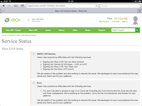
I received error message after error message with recommendations to reset my broadband connection, check some xbox connection website for troubleshooting, etc, until I finally got the notice that they are having a service problem.


Will try again soon--but I have to say, this would be SOOOO much better as a #SecondScreen experience...

Monday, December 5, 2011

My Review of SOAGear as a SecondScreen Experience

With tomorrow night's episode being the season finale of Season 4, I thought I would give a quick summary of the iTunes app.  The app is designed to be a fan-based commerce experience that provides timely and relevant prompts by synchronizing the items that are for sales with the content on the screen.  If you are a show fan, this is a great experience.  It provides a passive way to have t-shirts, jeans, shot glasses, rings, and jackets presented to you in a way that does no interrupt the viewing experience but allows for a quick purchase if something on the show strikes your fancy (Gemma's jeans, for example).


- Simple.  Season 3 in synchronized to the Blu-ray via Wi-Fi, allowing you to control the blu-ray player with the app.  Season 4 is currently only synchronized using audio-sync, so there is no control of the 1st screen.  None to Medium.

- Social.  None.  No Twitter or Facebook integration.

- Seamless.  None.  No integration of other sources of content.

- Stimulating.  Great, synchronized, content-driven commerce for the uber-fan of Sons of Anarchy.  High.

- Discovery.  There is no content recommendation or discovery feature.  None.

My Review of TVplus as a SecondScreen Experience

This is a decent synchronized #SecondScreen experience.  While it would be a better experience if they covered more shows (only covers some primetime shows Monday - Thursday), it is a good start for broadcast TV.  It uses audio sync technology to identify not only what show you are watching, but where in the show you are, and then attempts to deliver relevant content (a link to the iTunes song for purchase when the song is playing, a bio of an actor when they walk on the scene, historical related facts to the content on the screen, etc).  There are some improvements needed to get this app where consumers will want to use this over all other apps, but they are headed in the right direction.


- Simple.  The app does not allow you to control the 1st screen.  None.

- Social.  The bottom right hand side of the screen is reserved for current curated Tweets about the show.  Supposedly, they are also kept recorded with the time code of when they appear in the show so that when you watch a DVR'd version, you don't get spoiling tweets and the comments are in context.  There is an opportunity to check-in to the show and share Facebook comments. Strong experience and with more shows, will get better.  High.

- Seamless.  There is no integration with other sources of video.  The app assumes you found the content you want to watch in broadcast TV from your provider.

- Stimulating.  There are decent attempts to integrate other sources of information about the show in timely and event-relevant manner.  While we can debate the quality of the tagged content for the various shows (tidbits of info, music, pictures, bios, etc), this is a very good example for the industry.  It would be better served to have access to additional standard sources of information (similar to the way Fanhattan shows IMDB, Wikipedia, etc).    There is also a "Favorites" browser launch toolbar (within the app) for sites like Amazon, Facebook and TV Guide--but sadly, it does not attempt to pre-load an appropriate search to that site but drops you instead on the front doorstep.   Regardless of the limited number of shows available for the experience, this is a very good push in the right direction.  High.

- Discovery.  There is not a function allow you to get recommendations of content your friends are watching or to otherwise learn about trending or popular content based on your preferences.  None.

In Summary:

- Simple.  None.
- Social.  Medium.
- Seamless.  None.
- Stimulating.  High.
- Discovery.  None.

My Review of Umami as a SecondScreen experience

The Umami experience didn't live up to the recent hype I had seen in various articles, blogs and tweets.  The overall experience was ok.  It often had trouble trying to determine what I was watching via the audio sync.  Manual identification was easier.  For a "synced experience", the content itself was rather static (ie about the whole episode rather than a specific scene, event or timecode)--except for the live tweets of course.  Sorry to spoil the hype, but they don't take advantage of the sync technology and only offer rudimentary social integration and rather limited stimulating content.


- Simple.  There is no ability to control the first screen.  None.

- Social.  There is rudimentary social integration with Facebook and Twitter (keys on the name of the show, you can check-in, you can comment to friends).  The Twitter feed is real time (meaning if you watch a recorded show or on the the West Coast, you have a spoiler problem).  Medium.

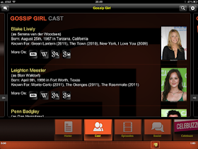
- Seamless.  There is no integration of content from multiple sources.  In fact, only a limited amount of shows are setup for the experience (Gossip Girl has Celebuzz for example) and it says that it only works for shows recorded within the past week.  None.

- Stimulating.  While there is audio synchronization, the level of additional information presented about the other episodes, the cast, or alternative information from Wikipedia, IMDB, etc, really isn't that great (compared to Fanhattan for example).  Low to medium.

- Discovery.  No real ability to integrate your friends' preferences or to help you find trending or popular content.  None.

Summary:
- Simple.  None.
- Social.  Medium
- Seamless.  None.
-Stimulating.  Low to Medium.
- Discovery.  None.

Wednesday, November 30, 2011

My Review of BuddyTV as a SecondScreen experience

BuddyTV was a surprise find for me.  I was impressed with the ease of setup and the option to command and control my AT&T U-Verse set top box (which was also very easy to set up).  While there are certainly improvements that can me made to the Social and Stimulating aspects, it is clearly a step ahead of many others in Simple, Seamless and Discovery.

Tuesday, November 29, 2011

My Review of Clicker as a SecondScreen experience

Clicker.com has been around about as long as GetGlue has.  Thought it was recently acquired by CBS Interactive, there has not been a significant amount of feature enhancement to the iPad app or the web site.  Essentially, the app serves as a decent tool for looking up a movie or TV title and finding out which service provider has it (I think Fanhattan is currently better at it), but it does not do much else.


- Simple.  It does not control the first screen, but will launch iTunes, Hulu+, or Netflix apps (closing Clicker of course).  The registration process (Facebook) is, however, very easy to do.  Very low.

- Social.  While on the surface, it seems to have the social tools of GetGlue or IntoNow, there is no Twitter feed integration and the majority of the social connections is just "checking in" that you are watching something (posting that to Facebook or Twitter).  You can't really follow other comments (or at least, not easily).  Low.

- Seamless.  The original point of the web site and now the iPad app was to provide a sort of uber-TV guide of which OTT service can meet your content needs as a consumer.  The web site does a better job than the iPad app (YouTube is integrated for example), but the Fanhattan app has a better UI for this functionality.  As stated above, you can launch some of the content directly on your iPad, but cannot search your DVR, channel-line up, local area network, etc.  Medium.

- Stimulating.  While it has a leg up on GetGlue in that it has episode level detail, most of the detail is incredibly cursory.  Some of the descriptive meta data about episodes is not even complete.  There is no integration of other sources of meta data (photos, Wikipedia, IMDB, etc).  Very low.

- Discovery.  Instead of a "Trending" view of showing you what to watch, you have a "Popular" view (based on the total number of check-ins).  You can also see what friends are watching, but Fanhattan does a much better job of both--and I wouldn't really call either function Discovery. Low.

Summary.
- Simple.  Very low.
- Social.  Low.
- Seamless.  Medium.
- Stimulating.  Very low.
- Discovery.  Low.

Monday, November 28, 2011

My Review of GetGlue as a SecondScreen Experience

GetGlue has been around perhaps the longest of any of the apps out there.  Functionally, it is essentially a sophisticated Twitter/Facebook sharing app that allows you to share and review comments about major entertainment categories (TV, Film, Music, Books, etc).  For its relative longevity and perceived high install base, it has relatively rudimentary SecondScreen functionality.

- Simple.  While the app itself is simple to setup and use, there is no ability to use it to control your first screen.  There is no audio or other synchronization for the app to tell itself what you are watching.  You literally search for what you want to comment on (like Twitter).  None.

- Social.  It allows you to rather easily integrate your Facebook friends and Twitter followers so that you can watch their "stream" of comments about the entertainment topics, but does not integrate the wider Twitter world as easily as some of the other apps (IntoNow, Fanhattan, Twitter itself).  Recently it has deployed a badge system similar to FourSquare.  Medium.

- Seamless.  There is no current capability to integrate the solution with multiple video services.  None.

- Stimulating.  Other than the social aspect (reading other viewer comments), the descriptive information (meta data) about the items in the category rarely gets below title level (ie no episode level details such as IntoNow, IMDB, Fanhattan).  You can see reviews and comments, but only again on a title level.  Low.

- Discovery.  There are some elements of discovery in the app: you can see your friends' recommendations, you can get the system to recommend titles to you based on your ratings of films, and there is a "Trending" category that allows you to see what are the most popularly engaged titles.  Medium.


There is both a laptop and an Android experience in addition to the iPad experience shown above.

My overall summary:
- Simple. None.
- Social. Medium.
- Seamless. None.
- Stimulating. Low.
- Discovery. Medium.

Thursday, November 24, 2011

Watching sports with a SecondScreen

I realize is Thanksgiving Day and that I should be focused on Turkey and football, not a blog.  However, I had a neighbor ask me an interesting question earlier today--"what is the best app to watch football with?"  I thought about all of the apps out there trying to do something with video and even spent a few moments previously and again today on some of those apps.  Here are some quick thoughts:

First, all of the apps key off live information, which is probably the most likely use case for any user.  So, if you had to Tivo/DVR the game, any one of these apps is going to spoil the ending for you right away by showing the final score.

Second, none of the apps use any kind of sync technology (other than the real time nature of the live event) to bring relevant information to the screen (in other words, it's great for scores, stats, and Twitter updates, but not contextual content).  Ironically, in this use case, the eBay app works because it picks up the two opposing teams for appropriate team paraphernalia.

Also, in terms of evaluation, keep in mind that none of these will control your 1st screen (Simple), they have varying elements of Social via Twitter and Facebook updates, no real Seamless integration, plenty of Stimulating content (scores, play-by-play, graphics, etc), and the only Discovery element is what teams are in the RedZone (NFL '11) or any alerts you have configured for your teams.  Stimulating doesn't cover commerce (buy the t-shirt or hat) and no contextual adds.  Still, isn't that the point of watching a live game (to be focused on the game)?

- IntoNow.  As I noted in an earlier blog, they do a decent job on major sports showing current score/stats, relevant comments from Friends and Everyone during the game, and usually a relevant Twitter feed (The Dallas game feed is somehow keyed to the whole NFL).  You can "check-in" and share comments, etc.

- ESPN Scorecenter XL.  Has all of the scores, play-by-play, and alerts for your teams for many global sports.  No play graphics, no audio stream.  Plenty of team video highlights as the game goes on/finishes.

- NFL '11.  Not surprising, the best 2nd screen app for today's games.  It not only has the score, the stats, but has a live play-by-play graphic, play-by-play commentary, near-live highlight videos, and an option for live a live audio feed.  Missing better Twitter and Facebook integration (for this app, I would expect at the play level during the play-by-play updates).

- NBA Courtside, MLB At Bat.  While neither is in season, they are both similarly engaging as the NFL '11 app.  The Courtside app gives you a graphic showing you where the shots occurred, who is on the leader board for points, rebounds, etc.  At Bat shows you the pitch-by-pitch speeds and location and has plenty of up to date player stats while you are watching.  They did a Fifa WorldCup app previously as well (graphics, scores, stats, alerts0, video highlights).

Other apps where I am less experienced:

- NFL SundayTicket.  Requires a DirecTV Sunday Ticket subscription.  Really designed as a 1st screen app.

- CBS Sports.  Very similar to the ESPN app. Give you scores, stats, and play-by-play (plus graphics) for many global sports.  Has some rudimentary Facebook and Twitter integration.

- Yahoo Sportacular.  Similar to CBS Sports app.  Good graphics.  Good play by play.  Does major global sports.  No audio fee.

- theScore.  Looks very, very similar to the Yahoo Sportacular app.  Almost too similar.  Same global sports, similar graphics, stats, and play-by-play.


- Scoremobile.  Not really designed to be a SecondScreen app.  Designed to be the 1st screen substitute when you can't watch the game.  Great play-by-play feeds, odds presentation, pre-game highlights, etc.

A smattering of sports apps.  Should give you an idea of what is out there today.  Enjoy the turkey!

Chuck

Wednesday, November 23, 2011

My Review of Watch With eBay as a SecondScreen Experience

If you download the update to the regular eBay iPad app, you will notice a new icon on the bottom left-hand side of the screen that says "Watch with eBay".  Honestly, the experience as a #SecondScreen app or otherwise is disappointing.  While the registration process is rather simple (your ZIP code, your provider), many of the channels in the channel line-up (I use AT&T U-verse) are missing and the items offered for the channels that do exist are only based on the title of the program (not the contents)--they are not even based on the descriptive metadata of the title itself (ie the summary of the Seinfeld episode, etc).  There is no audio fingerprinting (recognition) like you find in IntoNow and no apparent presence of audio watermarking--nothing to tell the iPad what channel or episode you are watching (you have to type it in).

- Simple.  It does not allow control of the 1st screen in any way what so ever.  In fact, the use of the app itself is not "simple" either.  You tell it what channel you are watching and it puts loosely related items up based on the title in the EPG.

- Social.  I couldn't find a way to share the items I was looking at or the experience in anyway (except passing the iPad to my wife).

- Seamless.  No integration with any video services.  

- Stimulating.  The app's purpose is an attempt to make the content experience richer by allowing you to buy relevant items--it just disappoints in that endeavor.

- Discovery.  I wish I could say it let you discover items to purchase (not the point of this axis), but it would be faster for your to type in the title of the show than to change the channel in the app as currently implemented.

I honestly did not take the time to check for an Android or laptop experience.

My overall summary (I hope this improves quickly):

- Simple.  None.
- Social.  None.
- Seamless.  None.
- Stimulating.  Low (a very disappointing low).
- Discovery.  None.


Monday, November 21, 2011

My Review of IntoNow as a SecondScreen Experience

If you haven't tried IntoNow on your iPad, you should.  It does a decent job of some of the things people are expecting from #SecondScreen experiences, though I do believe it will leave you wanting for a deeper, richer experience.

- Simple.  While it doesn't allow you to control the 1st screen at all, it does quickly identify the show you are watching thru its audio finger printing technology called SoundPrint (it does have trouble if someone is talking in the background).  It did a decent job with live broadcast, news and sports.  It also did a decent job with DVR'd material, even to the point of determining which episode of a syndicated series you were watching (an improvement over 6 months ago).

- Social.  IntoNow does a decent job of integrating relevant Tweets about the show you are watching.  It also allows you to quickly see what your friends are watching (assuming they have also registered and are using IntoNow).

- Seamless.  It has some very basic integration with iTunes, launching your iPad directly to the link to rent/buy the show (which is not a useful use cases since you are in theory already watching it...but could be useful if you are perusing your friend's viewing history).

- Stimulating.  It has some rudimentary integration with IMDB to give the viewer some additional details about the show's actors, etc.  When you are watching the news, it has related stories and related current Twitter trends about the topic--both of which are useful.  It does not currently integrate Wikipedia or the official website of the TV show, though I am sure that is an obvious next step.  

- Discovery.  While there is actually a "discovery" button, I haven't found anything it has turned up very useful.  In theory, Discovery should be recommending content to me based on trends, my preferences, and hopefully some variable giving it the opportunity to "surprise me" (vs. telling me I might like what other people are watching).  But so far, the app isn't doing much for me for recommendations or discovery.

It's also available on the Android, but there is not a laptop experience.

My overall summary (as of Nov 2011--I am expecting them to make improvements):

- Simple.  None (though simple to use).
- Social.  Medium.
- Seamless.  Low.
- Stimulating.  Low.
- Discovery.  None/Low.

Sunday, November 20, 2011

Other SecondScreen organization thoughts

@TVappmarket had a good article this morning ( http://ow.ly/7zvYV ) reviewing Umami's categorization of the space as (shown below).  They are both great ways to look at this if you are an app writer or maybe even and investor, but they are both views of the space from the business development world, not thru the consumers eyes.  For this potential change in consumer behavior to take hold, we need to focus as an industry segment on how consumers will perceive value of these new TV viewing experiences.  I think using that lense (which I outlined in a previous blog as Social, Simple, Stimulating, Seamless and Discovery) will keep all of us focused on pushing this revolution forward.

To continue the conversation, follow me @ChuckParkerTech

Umami's thoughts on organization of efforts in the space:

1) Network-initiated: apps built by the TV networks themselves, generally for a single show, since most viewers tend to be fans of programs, not content companies. The HBO Go and Bravo Now apps are obvious exceptions.
2) Check-in plays: low on content, generally focused on conversation and game mechanics
3) Guidance plays: focused on recommending programming to consumers across multiple platforms, based on algorithms and social cues

@TVappmarket's concept of organizing efforts in this #SecondScreen / #2ndScreen Space:


Companion TV is about automated and curated contextual content using temporal metadata and algorithms or human editing that's provided snackable content relevant to the format.
Play-along TV is about synchronous and asynchronous interaction and engagement with shows. Usually in realtime, but also with recorded shows - sports and games shows lend well to this genre. Game mechanics are a key element to this genre - with voting, predicting, quizzes, rating and community dynamics all playing a role. 
Transmedia Storytelling is a fork of multimedia and crossmedia that tools up the writers to use different technologies, such as second screen, social network, etc. to carry the narrative in new ways - using movements such as co-creation, ARGs, and crowd sourcing to bring the audience closer to the story.  Essentially it is the technique of telling stories across multiple platforms and formats using current and emerging digital technologies.