Monday, January 30, 2012

IntoNow released a new version of their app on the ipad - an updated review of their Second Screen experience

IntoNow (owned by Yahoo) released a new version of their iPad app today, promising more information about the shows, etc.  When I launched the app, it forced a re-login into the app (very seamless and easy).  Clicking on the activity button brought up the tell-tale audio sync screen which worked flawlessly in most of the scenarios I tried (unlike many other apps unfortunately).  It correctly identified the show I was watching and automatically "checked me in" via Facebook and Twitter (it did NOT give me an option to say "no" to its posting on my social networks).

It took me a little while in the UI to find the new features (maybe I am just tired).  I re-checked their "Popular" and "Discover" features to see if there was any real Discovery going on.  Popular, was no surprise, the most "checked into" content--the numbers per show in the last 24 hours weren't big (surprisingly only 300 or so for the most watched show) and since I "don't have any friends" in IntoNow except those who have gone thru the additional hassle of re-asking me to be their friend from some existing social network, my "Friends" portion of most popular wasn't very populated with information (btw, I still don't think the Amazon-style of your friends watched this so you should, too, is even low-level Discovery unless already filtered by your own likes/check-ins, etc).  The "Discover" section still seemed to be a Featured section (I could be wrong) as I am not sure how it could recommend Project Runway, King of Queens, and NBA Basketball when all it knows about me in the app is Hawaii Five-O (it does NOT import my previous Facebook likes the way some other apps like Fanhattan do).


Searching for the new features, I went back to the original "check-in" option (yes it made me check-in again--a feature I just don't understand with the poor track record of audio ACR these days, though again, the IntoNow ACR worked very well).  The Twitter feature had a page for cast members' tweets from the show (and the official show tweet) and a page of posts from the rest of the world about the show.  I could not tell if it was curated, but it was definitely not timeline managed (ie the ending was given away when I checked the tweets).

I finally figured out how to scroll the middle part of the title detail UI up the screen (wasn't possible in the previous version) to find the new Stimulating features in the app.  I was able to see the cast member details by actor (though the main page of actor photos didn't populate).  There were also in-app browser links to IMDb, the show's Official Website, Wikipedia, Facebook and "Shop" (which brought up a blank screen).  The iTunes link launched the iTunes app in my iPad to the Hawaii Five-O search.  All the other links worked reasonably well, though I still think just launching a browser page is risky for the consumer experience.

So, in terms of revising the November 11, 2011 review:

- Simple.  Still no ability to control the first screen.

- Social.  I don't think Social has really moved on from Medium.  Still hate that I have to be friends twice with my Facebook friends to connect to them--frustrating.

- Seamless.  There is still no integration of multiple content sources--it assumes you are watching TV and gives you an experience based on that source of content only.  It still launches you to iTunes, but again, I am not sure that is what consumers want in terms of Seamless content source integration.  Low.

- Discovery.  While I think they are trying to improve this feature, they have not made great strides.  The concept of "your friends are watching..." is not very helpful unless my own history of preferences are taken into account and since they do not use my Facebook history, the most they coud be using is my IntoNow history--limiting.  Still low.

- Stimulating.  They did make a marked improvement in additional content about the show, though haven't yet implemented any synchronized content experiences.  I would improve their rating from Low to Medium.

-

Sunday, January 29, 2012

A follow-on summary of the Second Screen apps reviewed so far


As expected, CES did turn out a few new apps and a few apps updated themselves, providing their consumers a better user experience (and rating in the process).

The summary conclusion is that Fanhattan and BuddyTV are now joined by M-Go and Dijit in the front running pack.  MediaEcho, Zeebox, IntoNow, GetGlue and TVplus create a second pack.  SOA Gear, Clicker, Rovi, Umami, Viggle, TV Dinner, Yap.TV, BravoNow and USAAnywhere make up a 3rd pack.

So, enjoy the current score card and check out the list below the graphic to see which apps are still to come, and plan on joining us in Santa Monica at the Second Screen Summit on February 22nd to discuss the business models, consumer experiences, and metadata that surrounds this exploding segment of the media industry.

A quick reminder about the methodology behind the ratings below: 
  • Because I still haven't reviewed all of the apps yet or even all of the apps in a particular category (network operators, sports, blu-ray title specific, network specific, Discovery, Social, Simple, etc), I thought it best just to show the scores as they have been published so far, ranking them by the total score of the five categories.  
  • I left the sports apps out since they all performed a very specific niche function in the Stimulating category but did little else.  
  • Keep in mind that some of these apps are in beta or are otherwise not yet fully available to the public, so are subject to change (and improvement).  See the individual blog entries for more details.
  • In the chart, black represents "none", red represents "low", yellow represents "medium" and green represents "high".

The 50+ apps yet to be reviewed: 

Bambi, Bones, Channer, DirecTV, Discovery, DStv Guide, Fanvibe, FIOS on Demand, Flingo, Grey's Anatomy, HashTV, HBO Go, HotPotato, i.TV, IMDB, KickFour, King's Speech, Leanin, Lion King, MyVideoSync, NBC Live, Numote, NyooTV, Pirates of Carribean, Playup, Pocket BigBrother, Screach, ScreenTribe, Shazam, Showtime Social, Smurf-o-vision, SocialGuide, Starling, Tapcast.TV, TV Chatter, TV Foundry, TV Tune-In, TV.com, TVChaser, TVCube, TVFriend, TVmoment, TvTak, VideoLive, Vloop, WatchParty, Wizzchat, XFINITY TV, Youtoo, Zap2It


Thursday, January 26, 2012

My review of the latest SecondScreen demo from MediaEcho at CES

While only a demo app, the latest features from MediaEcho leave the viewer with a feeling that there are great things to come in this space.


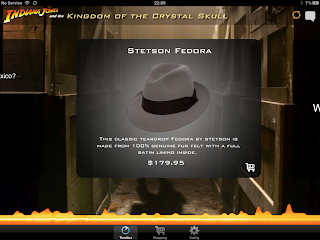
The app was running on an iPad, with a Blu-ray player, set top box and iPhone available. The first use case demo'd was similar to the King's Speech Blu-ray (super fan material sync'd during playback of the disc). The 2nd use case was similar to their Sons of Anarchy app which allows commerce during playback of the feature sync'd to the content on the screen.

The next use case was a geo-aware advertisement based on the location of the movie set (vs. your iPad's location), so it was contextual to the viewer of the content. Definitely contrary to the current world of sending you ads based on your own location. 


Then we walked thru some multi-view use cases. The 1st screen showing the view as intended, the 2nd screen showing a different angle. Think NASCAR where the primary view is the race track and your tablet is showing the view from your favorite driver. Then we discussed their concept of a "Social Heat Map", where tweets from the app were recorded at the timecode they were sent, giving a graphical view to the consumer of the most tweeted moments of the movie. With the bi-directional sync capabilities of Blu-ray, it meant you could "tune" immediately to those moments to see that scene and the tweets that went with it. It is like being able to aggregate a live viewing asynchronously. Beautiful idea. We finally went thru the various remaining social use cases (polls, chat, etc). But the best hint at the future was when they turned off the blu-ray player. The app immediately started searching for another sync point. It found the set top box and tuned the 2nd screen immediately to it. Then the demonstrator turned off the set top box and it started searching again. The demonstrator pulled out his iPhone to play a clip (in very noisy CES) and the app then tuned to the audio track within a few seconds. This could very well be the future of ACR--an algorithm that searches for the best sync point in the environment (Blu-ray, a video OS environment like Boxee or Netflix, a STB, then audio). This concept while simple could very well be a portent of things to come in this space. A synchronized experience has the power to be more relevant (not everyone can watch live--hence the massive success of DVR's and Tivo). It drives in-show commerce up significantly. It makes the "fan material" more fanatic, and it improves brand recall and click-thru on ads. Watch this space...

Disclosure: I previously worked for the company that developed this product, but purposely waited until I no longer did to provide this review in an outwardly unbiased manner.


Wednesday, January 25, 2012

An initial review of Viggle as a SecondScreen experience

Tonight must be beta night because there seem to be a plethora of new apps in the second screen hitting the iOS marketplace today but the functionality is just not ready.  Viggle, like TVDinner, launched with much fanfare and funding recently, but as a loyalty/rewards play vs. the "gaming" approach TVDinner is taking.  I was admittedly disappointed that it only had an iPhone experience, but will assume the tablet versions are coming.

No special account was required (open to the public).  The initial sign-up was thru my Facebook account.
I was greeted with a 1500 bonus point award for successful sign-up (yay).  I then watched a 2-minute video on how Viggle works, how the point system allows you to acquire real-world goods, etc.

I checked-out the featured show (or tried to), but Viggle requires that the ACR (audio sync in this case) works to allow you to check-in to the show.  Not one to be easily rebuffed, I tried other live TV channels.  I tried 5 or 6 with the sound cranked up (wife now upset) and stood next to the speakers.  Occasionally, it would tell me the list of networks it handles (seemed as upset as I was).  There apparently is no manual way to check-in to a show (if the ACR fails).  Seems like a serious UX flaw, regardless of what the requirements are from the brands/networks/advertisers.

I spent the rest of the time checking out what rewards I would be able to get if I could check-in.
I was able to check-out American Idol (a featured show) further to see what Stimulating content would normally be on offer.  Links to IMDB, Twitter (chatter), Facebook, Wikipedia, iTunes, Amazon and Bing.  IMDB didn't quite work right (launched me to the 2002 season).  Twitter worked fine but was not curated (Idol was on and there were too many tweets).

Then it suddenly offered me 10 Viggle points to book a reminder to watch Alcatraz.  Interesting approach.

I am going to check back in a few days to see if the ACR problem clears up.
I'd like to see the app working to get a real feel for it.

My initial guess on what we'll find:

Simple.  Probably none.

Social.  Probably Medium.  No curation is a problem for big shows like American Idol.

Seamless.  Probably none.

Stimulating.  A lot of stuff going on there.  I think the work on the cast/crew is light, but the rest of the links to content is strong.  I'd like to see some sync'd content for all that work on the ACR via audio.  Probably Medium.

Discovery.  Looks like none.

Let's check back together soon.  Some more images are below to give you a better feel for the app.


An initial review of TVDinner as a SecondScreen experience

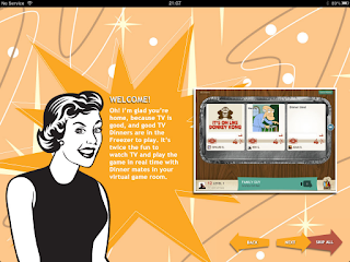
I signed up for an account today and they released it to me this evening.  They are clearly in startup-mode, so probably too early to give a full review, but I thought I would at least give everyone an idea of what's cookin' in TVDinner, the newly launched app/start-up for SecondScreen (man, this space is getting crowded) announced yesterday on LostRemote.

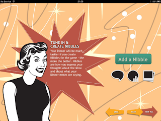
After getting the nod on my account, I had to log in with Facebook for access.  Ok.  I scrolled thru the "How to Play" slides describing what TV dinner is--essentially what seems to be a "game" made up of getting the viewer to engage (comments, polls, etc) on certain TV shows.  There is no description about a reward system (loyalty points) like you will see with Viggle in the next post.  Perhaps that will come later.

It looks like they have "sold" this into only certain shows, and unfortunately none of them were available after 9pm tonight when I got my account.


The list of shows they have seem to be a mix of popular series (Glee, Homeland) and a few live event shows (NFL, Oscars).

I threw in a few of the images describing what we hope to see tomorrow night.  Stay tuned.


My initial guesses:

Simple.  Probably None.

Social.  Probably Medium.  Will allow you to tweet/chat, do polls, etc.

Seamless.  Probably None.

Stimulating.  Hmm.  Hard to tell.

Discovery.  Looking very low from the descriptions.


Another look at BuddyTV as a SecondScreen experience

I have been getting emails from BuddyTV prompting me to come watch the show I put on my "watchlist" (Modern Family) when it is live.  I thought I would see if there are any significant updates in features that would change my views from my Nov 30, 2011 blog.

While it is still just an iPhone app (no iPad version), using the app to tune my AT&T U-verse receiver worked well.  It still cannot see my DVR contents though.  The "remote" button still allows you to use your tablet as a fully functioning remote.

It seems to be doing a better job as seamlessly integrating content than I remember, now offering the channel my show is on and the ability to rent from Amazon on the same page.

It still does a decent job on Discovery, showing me content based on a seeding algorithm I participated in when I started using the app a few months ago and offering me those recommendations across Netflix and my live TV provider (AT&T).


Social is still its downfall, with the ability to make comments only in a haphazard way.  It did take advantage of my Facebook friends list, but seemingly only to show me a list of friends I could share the app or TV show with.


Stimulating has not improved either in the past few months.  Still just a cursory review of the show description.

Summary:

Simple.  Still doesn't access my DVR, but still very strong.  Medium to High.

Social.  Still weak here.  Low.

Seamless.  Improving with integration of Amazon and Netflix. Medium to High.

Stimulating.  Still low.

Discovery.  Still strong with Medium to High.

Tuesday, January 24, 2012

My review of Oprah's OWN app as a SecondScreen experience

I had pretty high expectations with this app that was released during CES (though I don't believe it was at CES).  Oprah is known for her incredible attention to detail when it comes to her brand, but this app really is just an app shell interface to the existing OWN website.  I was intrigued first with the large "Sync" button, but despite trying for quite some time to get it to work (volume up, no noise, etc, etc), I could not get it to watch the show I was watching.

I gave the app my Facebook credentials, but I can't tell why it wants them.  Every feature from the main page brings you to the main OWN website, which does not recognize your app log-in and hence asks you for a website login.  It didn't even remember that I had already input my provider and zip code for the channel selector.  The schedule gave me east coast times for shows.  The Twitter feed button was literally just a browser launch to their Twitter page.  The Facebook feed button?  Well, I think you can guess.

So odd and disappointing for an Oprah product to be so mediocre.  She should have struck a deal with Yap.tv similar to USAAnywhere or perhaps built a Miso sideshow and at least had a serious app on the market place instead of a web browser with an "OWN" skin.

Simple.  None.

Social.  While you can see the Twitter feed, it is not integrated in any way what so ever.  I actually think using the Twitter app would be a better experience.  Very low.

Seamless.  No integration of any source of content (just a proxy for the TV lineup).

Stimulating. There are a few featured shows on the main page, but there is only a 4 line descriptor of the show itself behind the option to click.

Discovery.  None.


Monday, January 23, 2012

My review of Dijit as a SecondScreen app

Dijit was designed to work with the Griffin Beacon universal remote receiver to control your home theater, set top box, etc. It actually surprised me as a second screen app. It has a pretty standard registration process (your zip code, video provider, etc). Assuming you have the $50-70 Griffin Beacon, it is then designed to give you some level of control on your first screen (Simple). Full disclosure: I have not yet purchased my Griffin Beacon. I read the reviews on Amazon and the population is pretty much split on its performance. I have the Harmony One remote and it is likened to that (without the app of course). So let's give them the benefit of the doubt for now and give them a medium (no apparent control of the DVR, or I would say high).  More to follow in another blog soon.

But the rest of the app is surprisingly good. When you register your Facebook credentials and click on "social activity", it actually uses YOUR friends to drive a list of shows they have liked as a potential indicator of what you might like. It also uses what you have liked in Dijit or Facebook. It even double checks with you before it posts anything to either Facebook or Twitter.  How courteous (pay attention ConnecTV).

When you dig into the details of a show, it gives you rudimentary levels of information on the cast, the current episode, etc., using links to Wikipedia (which broke several times) for details on the actors. There is a list of YouTube videos that are in theory relevant, but not much else.


The Social component, while making a good use of your Social network to help you Discover new shows, does not do much more than let you check-in, comment, or like something. There is no curated Twitter feed or interactive polls, for example.

They make a half-hearted attempt at giving you a Seamless experience for multiple sources of content. To be fair, they have integrated your live TV and they offer to show your Netflix queue to you, but there is no integration of the two in a single search, for example.

Finally, while I love the fact that they are using my Social network to drive some sense of Discovery, there is not a real Discovery UI (ie help me find a program to watch) and it instead relies on you either searching for a show outright, scrolling through the channel line-up, looking at your Netflix queue, or reviewing "My Shows", which is where you find what your friends have liked the most.

Summary?

Simple. Based on the feedback I would give it at least a medium and promise to try it out and see if there is hidden DVR control or access. Medium.

Social. Great integration of my exisitng Social network an a good check-in/like feature, but no access to other features like curated Twitter feeds, polls, etc. Medium.

Seamless. Having the Netflix queue is really only 1 step away from needing another app. Low.

Stimulating. Not the best attempt at showing detailed, fan-based content (though better than most check-in services and better than I expected). Low to medium.

Discovery. While not a great UX, I am going to give them a little more credit for the use of my existing Social network rather than asking me to build a new one like many others.  Medium.


Sunday, January 22, 2012

My review of M-Go as a SecondScreen experience


Technicolor's MediaNavi division launched it's M-Go platform at CES, announcing it will be available on Samsung TV's, tablets and phones, Vizio TVs, and Intel powered Ultrabooks by the end of the first quarter.  While they don't pitch this as a Second Screen app per se, I thought we should review it on this blog because of the surprisingly strong feature set as a second screen application.  It's pitched on YouTube as an app to that combines all of your media including live TV into a single interface, yet letting you view it on the first screen.  The start of the demonstration I saw at CES yielded a clean interface with a "card" system showing the options of Live TV, TV Shows, Movies, Collections (your personal photos, music, etc) and OutMyWindow (a secure photo sharing service).

A few disclosure points:  1) this was a demo at CES for a product that launches in the Spring--I have not seen this in the wild yet.  2) I previously worked for the company that developed this product, but purposely waited until I no longer did to provide this review in an outwardly unbiased manner.

Drilling into the TV Shows card yielded an opportunity to browse shows that would be personalized for you based on your preferences and history.  The Live TV card had a "channel" that was personalized for you based on the time of day and your preferences, and similar to Buddy TV and Zeebox, promises to allow you to easily click record or to "throw" the show to your 1st screen.  The recommendations were personalized to any member of the household or the entire family, in theory solving the problem I currently have on my Netflix queue where a large number of my son's favorite Dinosaurs keep getting recommended to me.

When you finally selected a show or movie to watch, M-Go showed you where you could source the show from (ie Netflix, Amazon, etc), including their own directly licensed library.  They even promised to integrate with cable and telco operators in the future, truly providing a Seamless experience to browse or discover content and then launch your first screen directly to that location (Live TV, an OTT provider, or your DVR for example).

When you are researching a title, there is a deep selection of meta data available about the title, the cast, other movies, they were in, etc, etc.  They have even included some of the web-based experiences from the movie launch sites themselves, but as of this demo had no synchronized content available for the viewing experience.

Finally, their Discovery engine, powered by DigitalSmiths, was a breath of fresh air compared to many fo the apps out there.  In theory, the app took into account your social networks and your history for your individual profile and then used an algorithm to determine what movies, TV shows and even live TV you would find relevant and interesting.  So far, this approach has been the best I have seen working (of course, in a demo).

Summary: so while not being promoted as a Second Screen app, it has a pretty strong showing in 4 of the 5 feature categories we have been tracking.  I will definitely want to follow-up when this app launches.

Simple.  Promises great first screen integration for Samsung and Vizio and integration into major operator network set top boxes.  High.

Social.  Allows for liking and commenting, but does not have the level of social integration we have seen in other apps to date (yap.TV and Zeebox for example).  Low.

Seamless.  Best integration of other sources of content I have seen yet.  Includes your operator VOD (in theory), your live channel line-up, your DVR, to local network, the M-Go licensed library, and Netflix, Hulu, Amazon, etc.  Each time, it launches you directly to your feature.  High.

Stimulating.  It has a decent Fanhattan-like metadata experience, but no synchronized content experiences.  Medium.

Discovery.  Best I have seen so far.  I am reluctant to give it a very high score until this is live in the wild and I can test drive the recommendations myself, but the approach to the experience and the UI were strong.  This was Discovery, not Search or "your friends like this so you might, too".  Medium to High.


Wednesday, January 18, 2012

My review of ConnecTV as a SecondScreen Experience

While I had good things to say on Sunday for the fledgling app during the NFL game, it was not that impressive tonight.  To start with, I sat down with my wife who was watching one of her recorded shows.  ConnecTV relies on ACR or your manual tuning to pick-up a show--but only picks up a limited list of current shows from your provider--so no DVR'd material.  Arrgh.


Then I asked the wife to indulge me in some live TV for a bit.  She took her iPad upstairs to finish her show and I tuned into the first network (CBS) I could find.  It struggled to pick up the show, so I turned up the sound rather loud and it picked it up.  Little did I know it was secretly posting to my Facebook account while this was happening, never asking for my permission or telling me it was happening.  I have to admit, this is the first "auto check-in" app I have seen that offers without a confirmation of sorts and without informing you--gonna upset a few people I am sure.  Ironically, I found out about this when a friend complained I had posted 5 or 6 different shows in a matter of a few minutes while testing the ACR...nice. [as I was about to post the blog, I tested a few more things and did notice a very small text pop-up about 15 seconds after I tuned to a channel saying I was checked-in, and then it disappear after about 1 second--not the right UX for this kind of thing--on to deleting them all from my FB.]

The content that appeared during the sync'd experience didn't "wow" me.  Maybe I am jaded by some of the prowess of the other apps, but similar to Sunday's experience, I essentially got a new factoid on the main actor about every minute (fine with the timing), with an ad below it, and that was it.  I had the Twitter feed on the right, but they have this funny thing about my friends who are commenting in general and, of course, despite being quite brash with my Facebook credentials on check-ins, I apparently have no friends in the ConnecTV world and need to re-build my network.  Arrgh again.

I switched to another show on another major network during primetime and actually saw almost no activity (the 3rd post was 6 days old).  I am assuming they have a smaller population of users right now. The rest of the experience was the same--weak synchronized content, and an advertisement.

So I switched to the Mavericks-Clippers game.  Similar to football, it actually did a decent job of showing you current stats, the last play, etc.  During the commercial, it branched out to ESPN news, the Sport Center highlights, etc.  The experience here was not on on the level of Courtside by NBA, but was pretty good.

I finally waited and tried the news and ESPN Sports Center and the Weather Channel.  Fox had an interesting UX (showing the news stories being discussed), ESPN had a similar UX, and the Weather Channel was blank (why show it?).

So, the summary?

Simple.  None.  Despite knowing my provider and zip, there is no attempt at tuning my TV or telling me what channel to change to.

Social.  I think its low at best.  Sure it has Twitter and Facebook integration and lets me "chat", but since it doesn't recognize my Facebook friends, I have no one to chat with.  Then there's the stealth check-in abuse of my FB.  Arrgghh.

Seamless.  No integration of multiple sources of content.

Stimulating.  They get some credit for the ACR synchronization, but they aren't really utilizing it.  Worse, it only works on live shows--good for the networks, bad for real consumers these days.  I would say Medium (without the ACR, I would say low).

Discovery.  None.


Tuesday, January 17, 2012

Test Driving SecondScreen for Sports and Celebrity Entertainment Last Sunday

As I said in my previous post, I wanted to test drive some of the SecondScreen applications "in the field" with some good friends as we gathered around the large screen TV watching the Packers break our hearts during the NFL Playoffs and various actresses melt them as they took awards at Golden Globe Awards.

I started with DirecTV (will blog about the full experience soon) since my neighbor had it and loved their service.  He considers himself technically adept and after we downloaded the app, was surprised he had never heard of it (marketing problem again) because he instantly loved ALL of the features, especially the streaming within the home that he had just spent considerable time finding an alternate solution for.  While the app was very good for finding out which game was on and could tune the TV for you (very Simple though we had some trouble with that function),


it wasn't nearly as engaging graphically or with statistics as the NFL '11 app was.  Surprisingly, the ConnecTV app (just launched at CES), was a pretty engaging (Stimulating) as a Second Screen sports experience.

All of them were relatively limited in their Social ability.  ConnecTV was probably the most advanced with a decent "show" Twitter feed. None of them recognized your friends in Facebook as your friends in their app (despite asking for the credentials--arrgghh).


Finally, all of them also fell short on the Seamless and Discovery features.  So, hats off to NFL'11 for having great play-by-play graphics, stats, and information about the team and congrats to ConnecTV for coming out of the gate with a decent sports experience.


So then we moved on after our bitter defeat to the girls' favorite of the evening - the Golden Globe Awards.  I tried in vain to find a dedicated app (there was one last year for the Oscars that was pretty intense) and was even more frustrated when I found the E! On the Red Carpet app after the red carpet had ended (would have been good to test it).  This time I bounced around with my friends on the yap.TV app and ConnecTV.  I did briefly try to bounce into tvplus (really struggled to use it's ACR to recognize the show, which did nothing for us when it was successful), Umami (also an audio sync up-front requirement that was disappointing for all the "shhh-ing" going on), and Miso (I had forgotten you could only check-in and see what other shows are trending).

Here, the ConnecTV experience was pretty poor.  I think they had put all their effort into the playoffs and had left the awards show alone.  There was limited Stimulating Content (thought the syncing worked relatively effortlessly) and it kept repeating a stream of 5-7 factoids that had nothing to do with what was on the screen at the time (even the news links seemed canned and a week old).


 You'll notice the tweets on the right hand side had nothing to do with the show (shameless promoting to someone who had clearly already downloaded the app) and the "What's trending" was great if you were bored and wanted to know what everyone else was watching.  They did manage to squeeze an add in (not seen very often YET) in a relatively unobtrusive manner.


yap.TV was much better for the Twitter integration (capturing what looked to be a semi-curated feed on the show in general) and allowing you to toggle back and forth between a "out in the wild" Twitter feed and the official GoldenGlobes feed (which allowed you to see exactly who won what without any clutter).

 Unfortunately, that is where it ended for yap.TV.  The polls section was left relatively untouched during the show and they did not offer much else except for a very glitzy opening image.
When I finally got Umami working, it did have an interesting Wikipedia link, but then again the rest of the app did fall extremely short.

None of the apps had anything in the way of Simple, Seamless or Discovery.  Stimulating was relatively weak considering what could have been presented.


So my take-aways:

1.  The average consumer is still a long ways from this being a behavior they understand.  I asked at the start of the day who knew what it was.  None did.  I explained it.  All of them said they'd never use a second screen--yet during the shows all of them grabbed their phones and tablets at various times to look something up (not always related to the show).

2.  The app developers continue to have a long ways to go to achieve an app that provides the user with better control of the first screen (Simple), strong integration with their friends (Social), integration of multiple sources of content (Seamless), an engaging experience (Stimulating) and the ability to find new and interesting content (Discovery).

Hang in there everyone and back away from that window ledge.  In 1995, my then-girlfriend (now wife) told me the Mosaic browser was too slow and too ill-featured to ever catch on as well.  There are too many good reasons (200B of them) to spend the time and money to get these experiences right.

Monday, January 16, 2012

Post - CES SecondScreen Roundup

CES was surprisingly light on SecondScreen and SocialTV.  Essentially, there were two new applications launches during the show (ConnecTV and M-Go), one demo application (MediaEcho for Indiana Jones Crystal Skull app) and a new app (OWN) that at least publicly launched during or just after the show.  Dijit did a new release during the show and Zeebox and GetGlue announced new money during the show (from Sky and TimeWarner respectively).  Civolution announced (nearly non-stop) that they signed their first official customer (ConnecTV, even sharing a booth with them) and Gracenote announced their intention to compete with them and Audible Magic in what is now being called "ACR" technology (Automatic Content Recognition).  I also saw an RCdB demo of "WatchWith" in the Miramax suite.

In theory, a great opportunity to leverage any progress amongst these or the other early leaders (Umami, TVplus, yap.TV, Miso, Fanhattan, IntoNow, BuddyTV) could have been the NFL playoffs over the weekend or the Golden Globe Awards on Sunday (I'll review my experiences in the next few blogs).  But honestly, there wasn't a whole lot of progress made on the big consumer viewing opportunities in the first half of January.  Marketing was light and the experiences didn't wow many (did you see any articles today on them?)--though I did see one good consumer "so what" link from Disney Second Screen.

So, what's next?  Reviews on ConnecTV, M-Go, OWN, the Crystal Skull app, and the new Dijit release. Additionally some commentary on my attempt to watch some NFL and the Golden Globes on Sunday with a SecondScreen.


Sunday, January 8, 2012

A summary of the SecondScreen Apps Reviewed So Far

I spent a good amount of time considering the best way to summarize what we've reviewed to date as a precursor to CES.  Because I haven't reviewed all of the apps yet or even all of the apps in a particular category (network operators, sports, blu-ray title specific, network specific, Discovery, Social, Simple, etc), I thought it best just to show the scores as they have been published so far, ranking them by the total score of the five categories.  I left the sports apps out since they all performed a very specific niche function in the Stimulating category but did little else.  In the chart, black represents "none", red represents "low", yellow represents "medium" and green represents "high".

The quick conclusion is that Fanhattan and BuddyTV are way out in front of the other apps.  Zeebox, IntoNow, GetGlue and TVplus create a second pack.  SOA Gear, Clicker, Rovi, Umami, Yap.TV, BravoNow and USAAnywhere make up a 3rd pack.

Now I am expecting that we will see a ton of updating activity this week at CES.  Some of the companies building the apps below have just received new cash infusions (ie Miso) and will be showing off the results soon (we hope).

So, enjoy the current score card and check out the list below the graphic to see which apps are still to come (before the February 22nd conference).


The 50+ apps yet to be reviewed: 

Bambi, Bones, Channer, Digit, DirecTV, Discovery, DStv Guide, Fanvibe, FIOS on Demand, Flingo, Grey's Anatomy, HashTV, HBO Go, HotPotato, i.TV, IMDB, KickFour, King's Speech, Leanin, Lion King, MediaNavi, MyVideoSync, NBC Live, Numote, NyooTV, Pirates of Carribean, Playup, Pocket BigBrother, Screach, ScreenTribe, Shazam, Showtime Social, Smurf-o-vision, SocialGuide, Starling, Tapcast.TV, TV Chatter, TV Foundry, TV Tune-In, TV.com, TVChaser, TVCube, TVFriend, TVmoment, TvTak, VideoLive, Vloop, WatchParty, Wizzchat, XFINITY TV, Youtoo, Zap2It


Friday, January 6, 2012

An infographic data roundup for Second Screen

There are quite a few skeptics out there about Second Screen and SocialTV.  Some of them say this is a fad.  Others say, "So what?"  Here's the "so what."

  • ·   110,000 Social comments on average per episode for X-Factor, the “most buzzed about” series in 2011
  • ·         23% of the people viewing the ad on the second screen engaged with it
  • ·         1.8 billion “likes” on Facebook for TV shows
  • ·         25% of 18-24 year-olds are interested in having more social features integrated into their TV viewing experience
  • ·         $200 billion - Size of the global TV advertising market
  • ·         1% increase in TV ratings is the result of a 14% increase in social buzz
  • ·         5,567,954 Social comments on the MTV Music Video Awards
  • ·         86% of mobile internet users are using smart phones or tablets while watching TV -- 92% of 13-24 year-olds do the same
  • ·         5,641,263 Social comments on Prince William and Catherine’s wedding
  • ·         70% of sports viewers would like to interact while watching a sporting event
  • ·         38% say that browsing the web enhances their TV watching experience
  • ·         300% increase in sales for show related fan items after the deployment of a sync’d second screen app

Sources: Park Associates, CMO.com, appmarket.tv, Bluefin, lostremote.com, Nielsen, aboutecho.com, gplus.com, guardian.co.uk