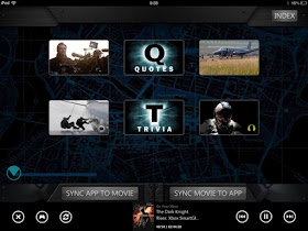
 When you play the movie after purchasing on Xbox Video marketplace, SmartGlass (on your tablet or smartphone) automatically recognizes the feature that is playing and looks for an enhanced SmartGlass experience (no need to install a movie-specific app on your device). Similar to Blu-ray experiences for other movies, SmartGlass lets you perform all of the obvious remote control use cases (skipping chapters, pausing, syncing the movie to your point in the SmartGlass or syncing SmartGlass to where the movie is, etc) and has all of the great Stimulating rich, related metadata you would expect (character bios, director interviews, behind the scene videos, etc), but where it really out shines other movie companion experiences is in the UX behind the Enhanced Stimulating experience. To this point in the industry development, most well-designed experiences have been smart enough not to inundate the consumer with too many synchronous events, usually waiting at least 45-60 seconds in between events, often broken up by scenes. But the Dark Knight Rises experience took this to the next level, grouping 6 potentially engaging experiences together in a chapter UI, giving the consumer the option of where to explore during the chapter, and then opening 6 new experiences when the next chapter begins (synchronously). This allows for a few improvements from the consumer's point of view:
- The consumer gets to choose when and what to explore (within the chapter). This means he can disengage at different points then potentially anticipated by the experience developers and can choose what interests him.
- There is not an overwhelming choice of possibilities (6 choices is thought to be potentially optimal in the decision making process for a UX).
Now keep in mind that this is essentially an HTML 5 experience, delivered to the SmartGlass platform via web services. Most of these assets should be re-usable in the Blu-ray experience, and in the future, for other eco-system experiences. The real industry question: who will develop a publishing platform where the content creator (Warner in this case) can create an experience once and publish to multiple platforms (SmartGlass, Blu-ray, and perhaps iTunes, Vudu, Amazon or Netflix in the future)? The eco-system proliferation (for major ecosystems) is inevitable, but perhaps the additional publishing costs are a fair trade for not having to create movie specific apps that the consumer has to find and install (improving use rate). Additionally, this is sign that the industry is maturing quickly, creating platforms that support content-specific second screen experiences with minimal consumer and publishing costs with no app to install and reusable assets respectively.
Quick experience feature summary:
- Simple. Great remote control features and synchronization capabilities with the feature. High.
- Seamless. While SmartGlass itself offers the Xbox Video market place, Vudu and CinemaNow for this feature, the in-movie experience doesn't need to offer other content locations (you already own it on Xbox by then). None.
- Social. The ability to share in the Xbox world is still there, but it is much less obvious how to share to Twitter or Facebook or gain access to their previous comments. Low.
- Stimulating. In spades with a great UI.
- Discovery. The app offers related content suggestions before you hit play (which makes sense).

No comments:
Post a Comment
Note: Only a member of this blog may post a comment.